Hades Cá Vir
Brand Identity, 2023
As for the origin of the brand Hades Cá Vir, it emerged in an iconic location in the historical area of Santa Maria da Feira, with the aim of serving customers a diverse menu of tapas and snacks from various regions around the world, ranging from Portuguese dishes to Spanish cuisine, and extending to the regions of Mexico and Greece.
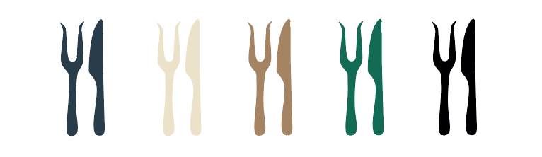
The idea was to 'play' with the Portuguese language, transforming the phrase 'hás-de' into Hades, referencing the Greek god. This gave rise to the element that would become part of the brand's visual identity, eventually becoming its main feature. The brand's icon, for example, represents a fork and knife, with the fork shaped like Hades' scepter, as depicted in the brand's logo..
This project was developed by João Lopes for the brand Hades Cá Vir
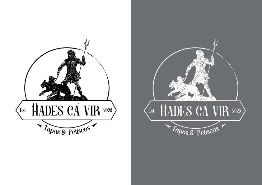
Monochromatic version of the logo
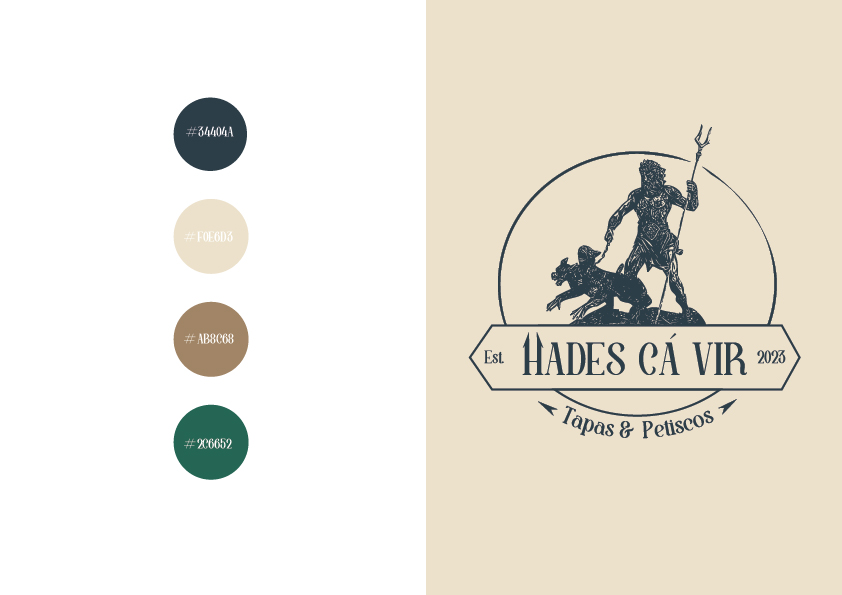
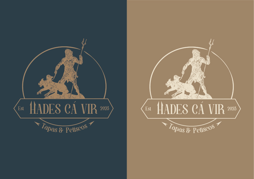
Color application to the logo
Icon development
The icon was designed to represent/indicate the brand and can be used and applied across the various forms of communication the brand wishes to implement. Below, the icon is displayed using the colors applied to the logo, which should also be used for the icon.
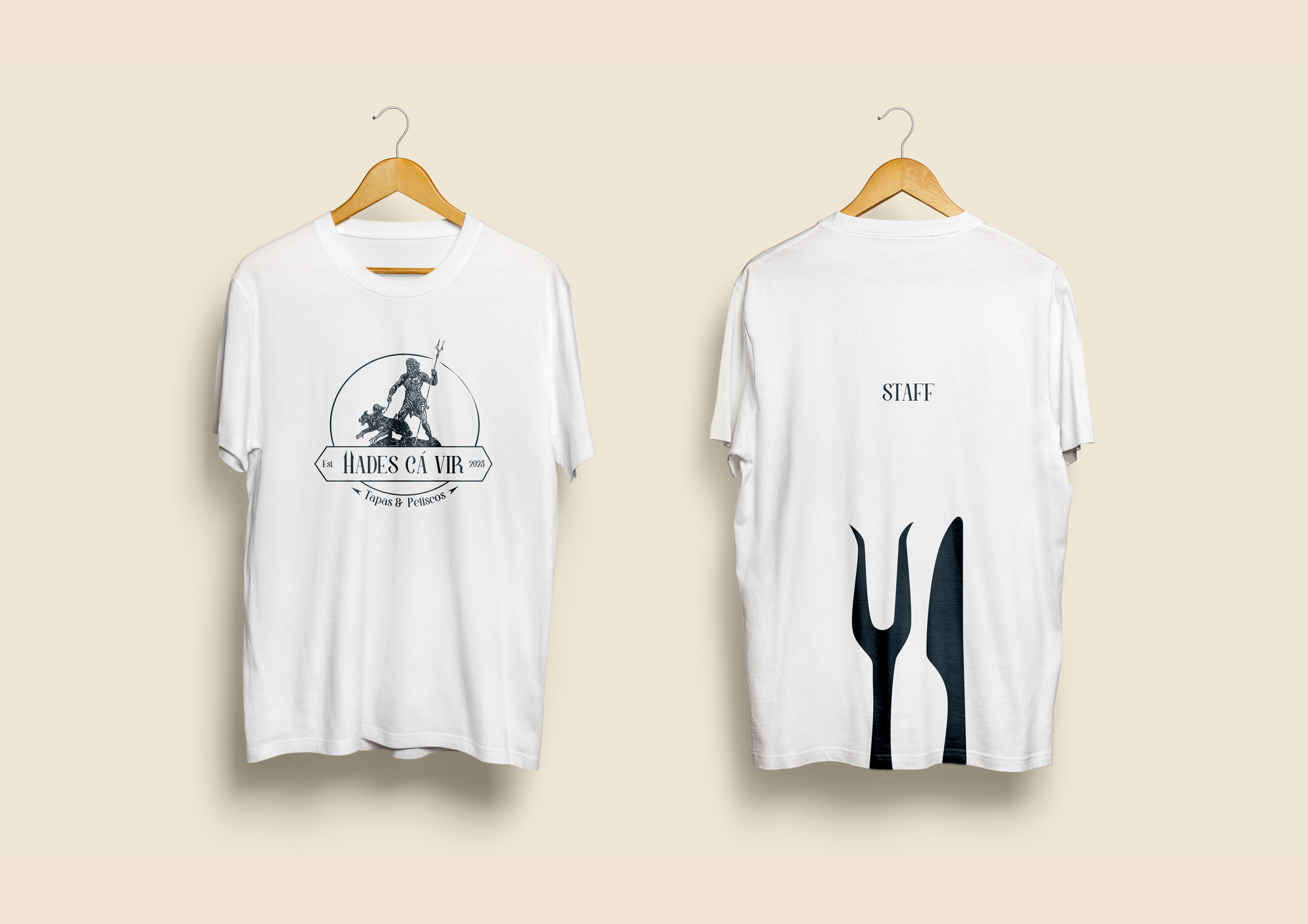
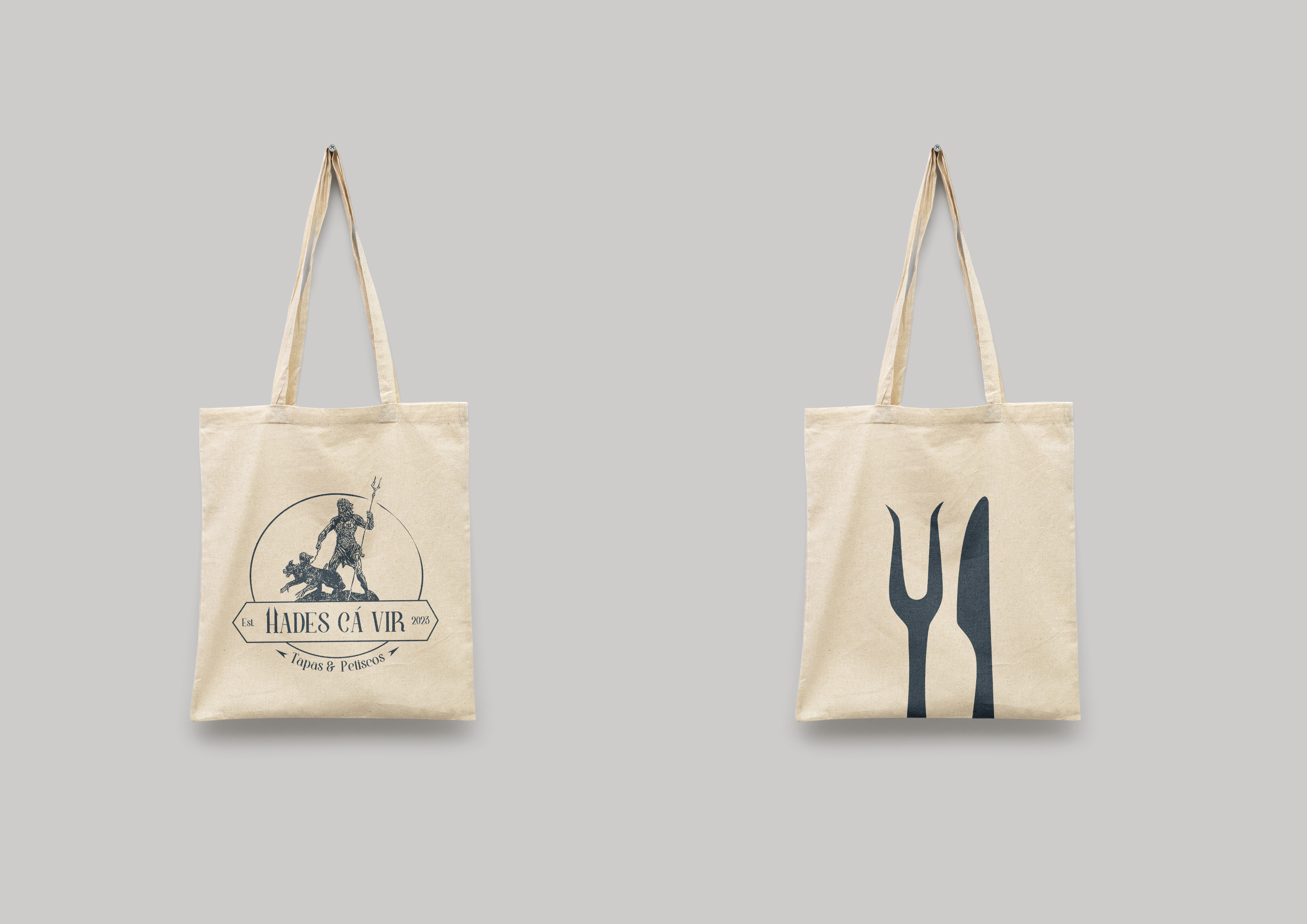
Logo and icon applied to merchandising
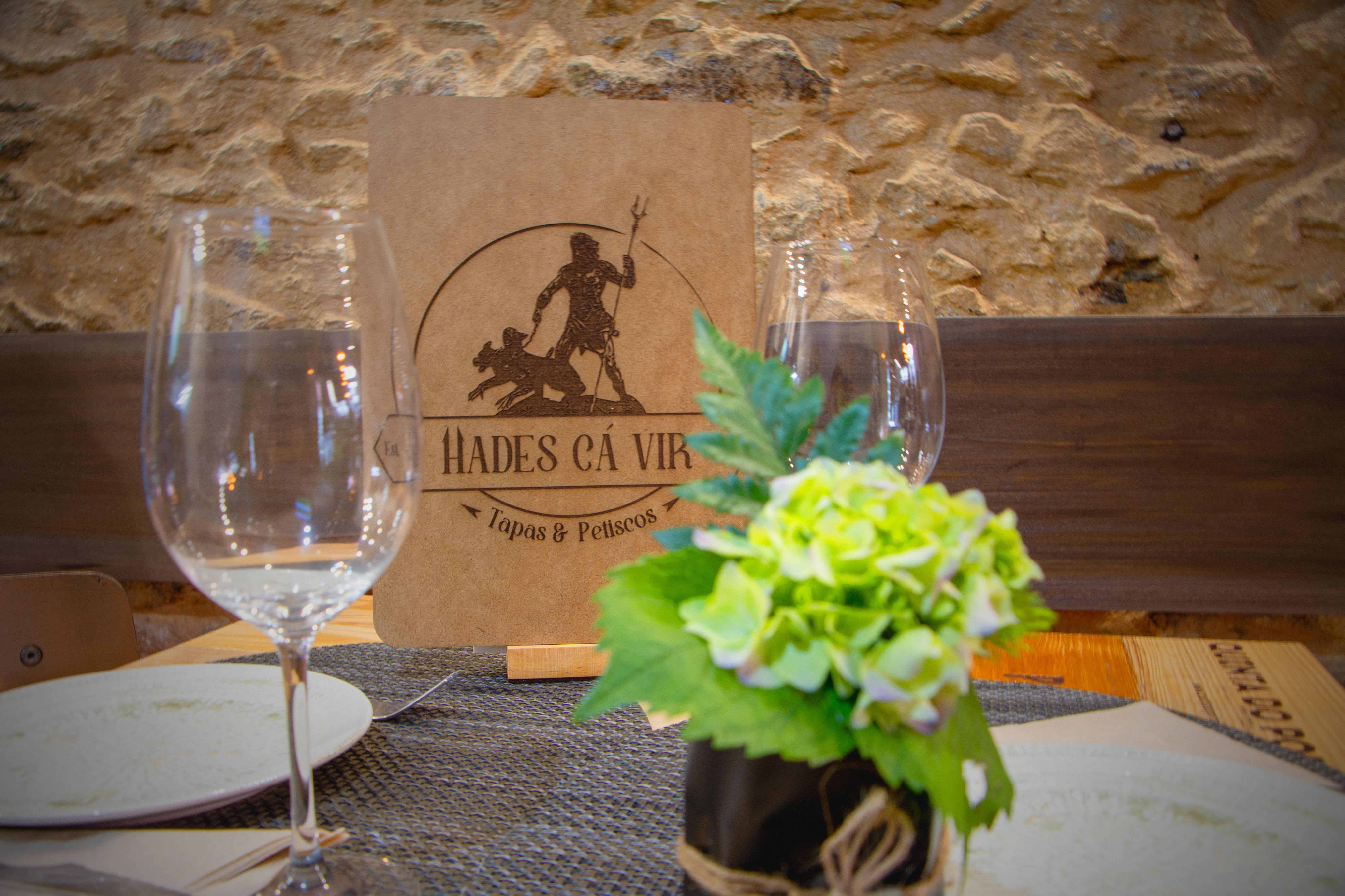
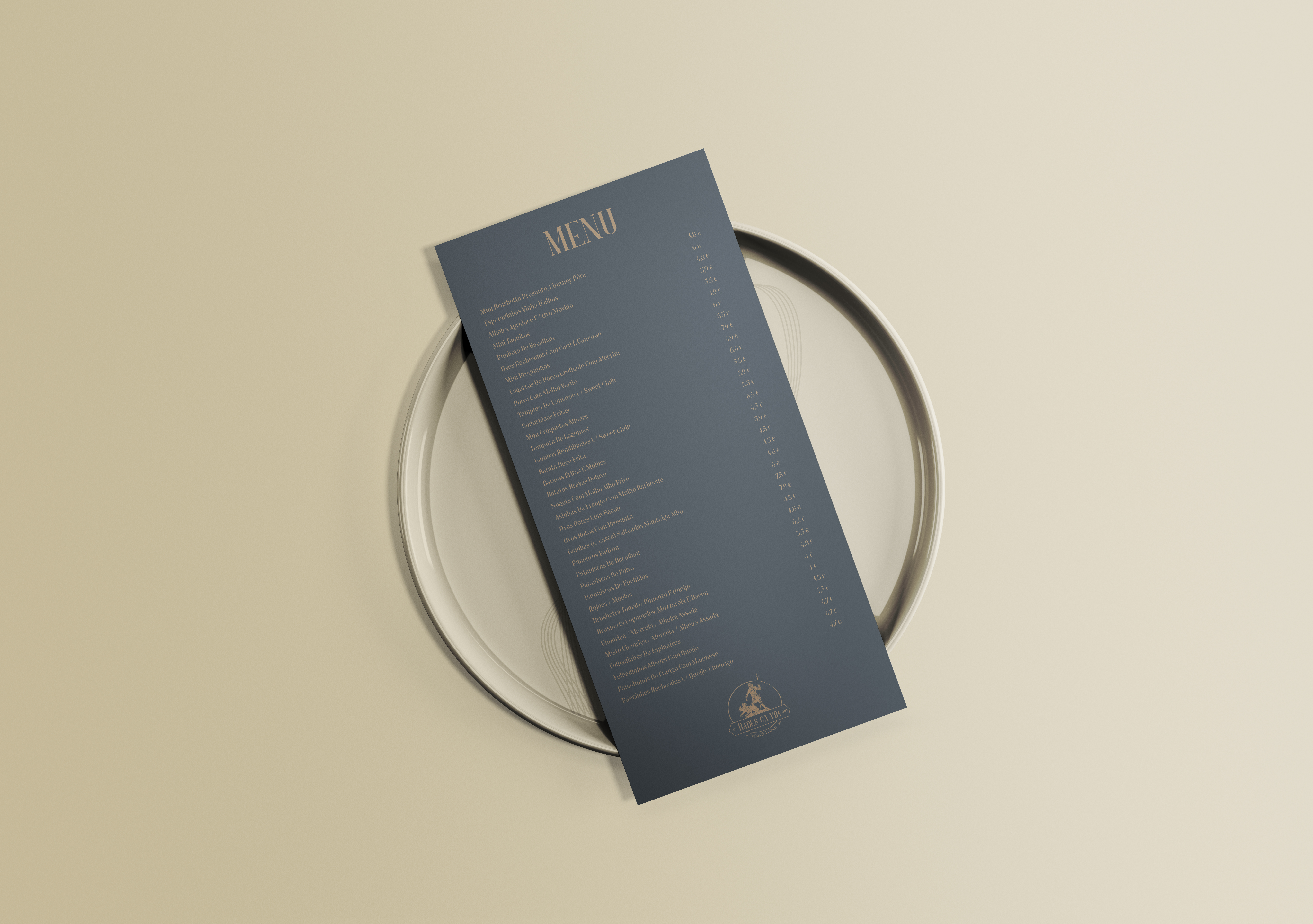
Menu
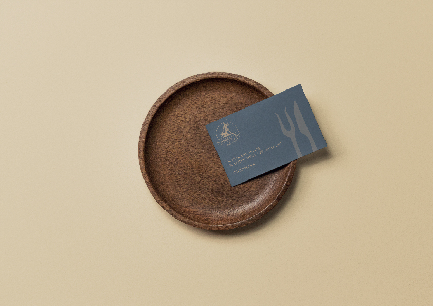
Business Card
Logo applied to the back of the wooden menu